The Salisbury Symphony Orchestra, a century-old institution, approached me to refresh their brand identity, including a new logo, poster, concert programme, and printable tickets for their upcoming major concert. The challenge was to modernise the logo while maintaining its familiarity for long-time patrons, appealing to both their existing audience and attracting new attendees. With a significant portion of the audience being musicians, it was crucial that the designs resonate with a musically literate demographic.
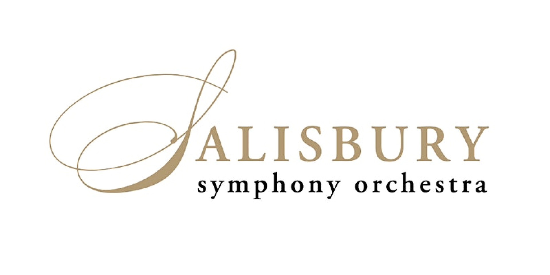



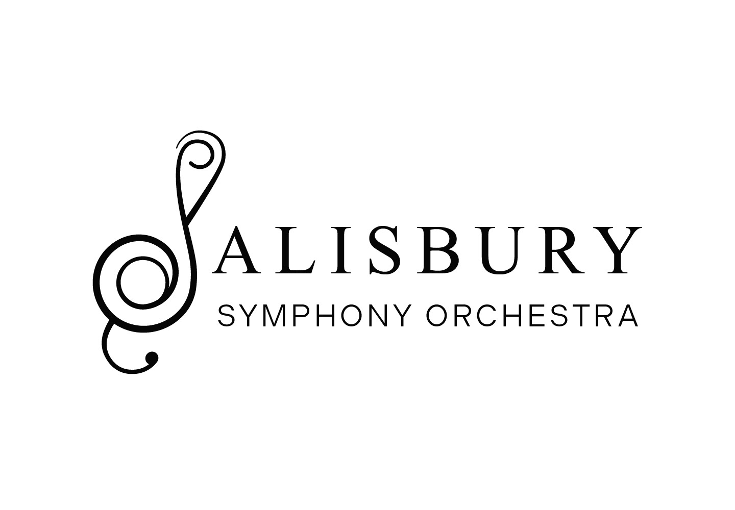

The updated logo preserves a classic, traditional feel, echoing the legacy of the original mark while incorporating contemporary elements. I designed the "S" as a stylised treble clef, integrating the initials “SSO” to subtly represent Salisbury Symphony Orchestra.
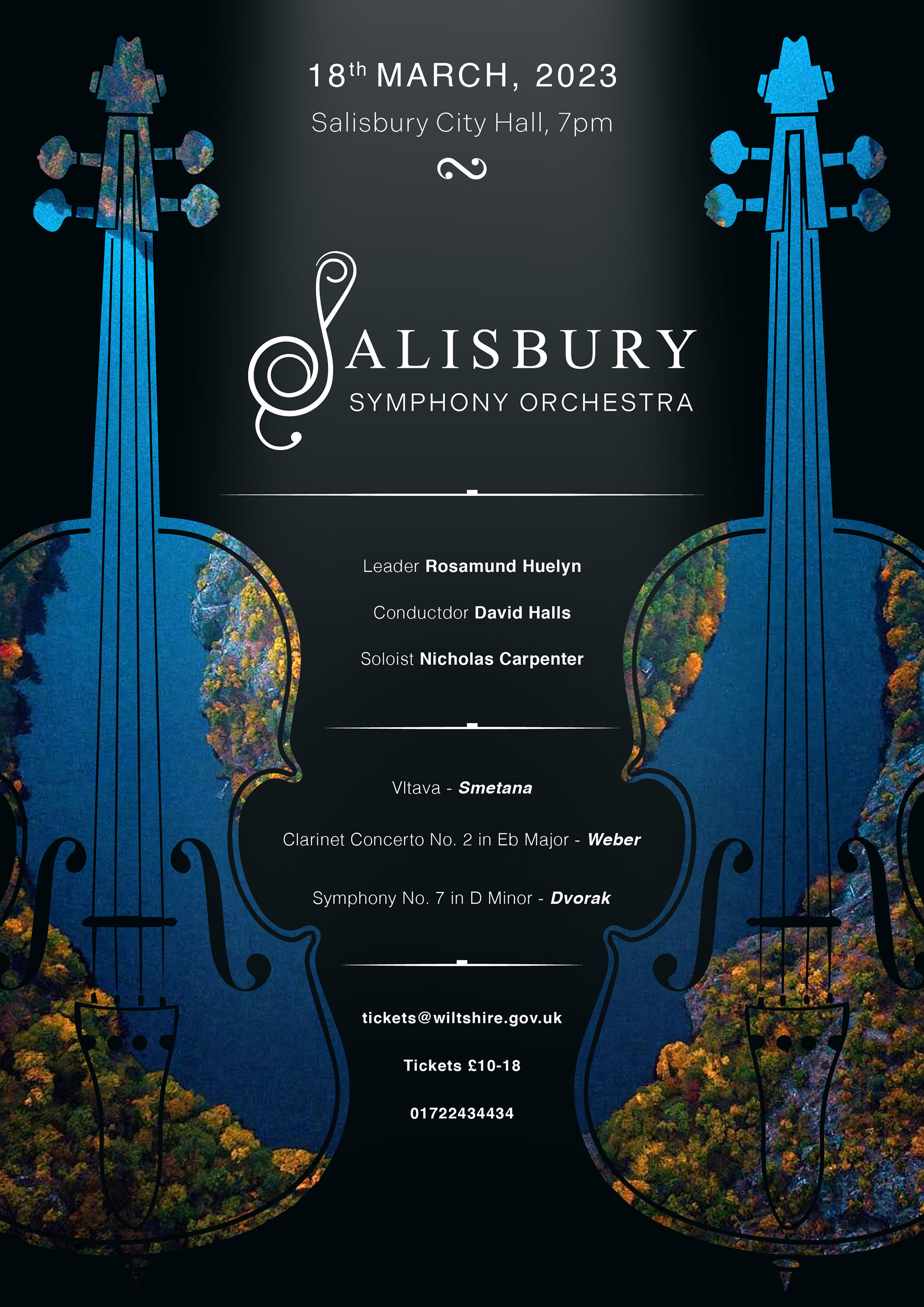
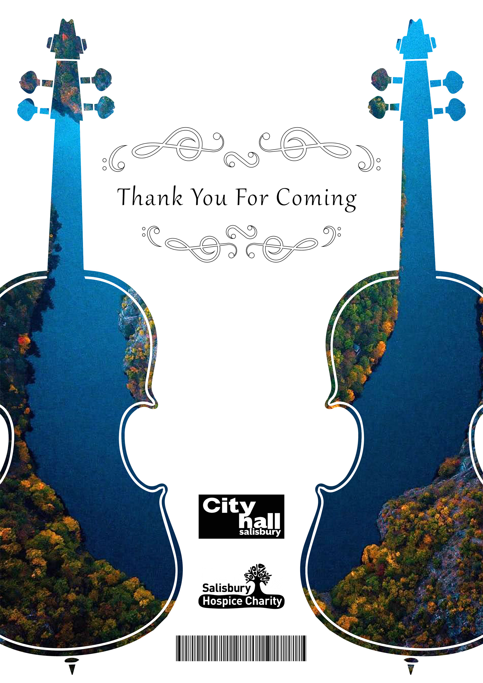
For the concert poster, the chosen musical piece, Vltava by Smetana, inspired the entire aesthetic. I used a scenic image of the Vltava river as the background, layering high-quality vector illustrations of violins over it to create an immediate connection to classical music. Musical symbols were used throughout the layout, filling negative space and adding visual rhythm; the ‘rest’ symbol serves as a separator in the text, enhancing the theme.
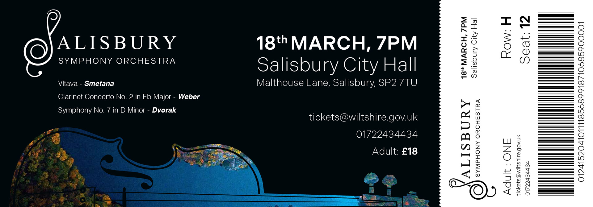
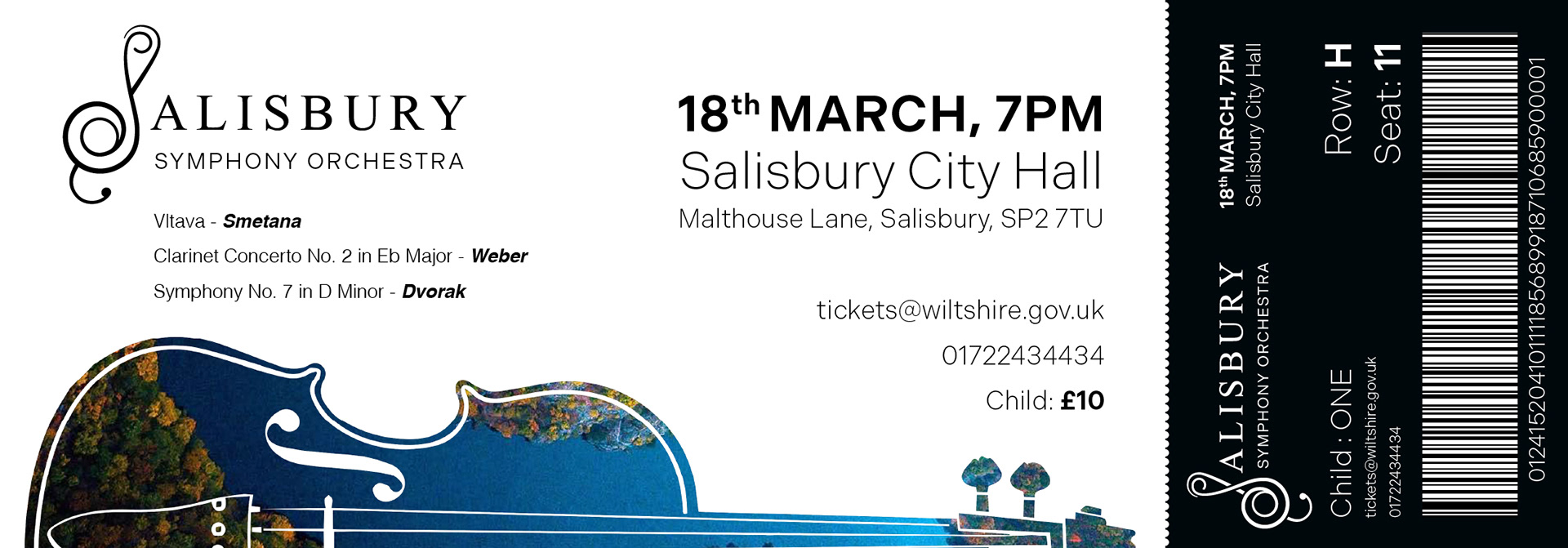
To ensure visual consistency, I extended design elements from the poster into the tickets and concert programme. The musical “turn” symbol was included on each page of the programme as a subtle nod to the audience's musical expertise, reinforcing their connection to the designs and the orchestra’s heritage.
