1. Initial Consultation & Understanding Requirements
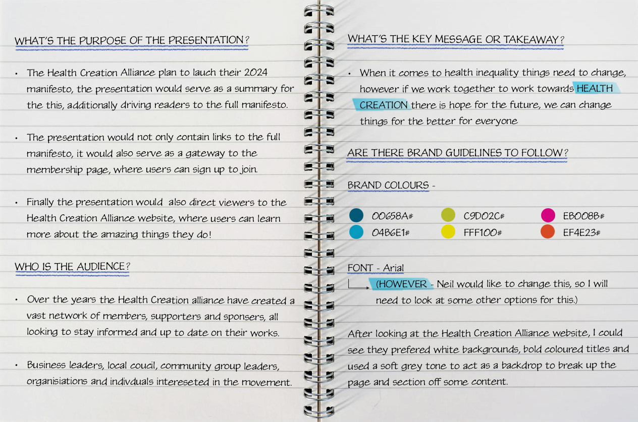
I was approached by Neil, the Director of Communications at The Health Creation Alliance - an incredible charity and the leading national cross-sector movement focussed on improving health and wellbeing. Neil explained their goal of releasing the organisation's 2024 manifesto, alongside a series of supporting documents, and running a social media campaign to support the initiative.
I initiate each project by gathering comprehensive information to ensure a thorough understanding of the scope, objectives, and target audience. After an in-depth discussion with Neil, I identified the following key insights:
I initiate each project by gathering comprehensive information to ensure a thorough understanding of the scope, objectives, and target audience. After an in-depth discussion with Neil, I identified the following key insights:

2. Research & Concept Development
Next, I conducted thorough market research to gain deeper insights into the client's industry, ensuring that the design aligns with current trends and effectively resonates with their target audience.
Here are my key findings:
After completing my research, I created a mood board using brand information and images Neil provided, combined with my market research, this mood board served as a valuable reference for developing design layouts and themes that would align with the project's goals.
3. Wireframing and Initial Design
I began by focusing primarily on the layout and flow of the document, without incorporating colour schemes or detailed graphical elements at this stage. To achieve this, I presented my initial versions in grayscale, using placeholders for any icons. I was particularly mindful of ensuring ample space around the text, to future-proof the design for further updates or additional content in the editorial document.
After thoroughly reviewing the presentation, I recognised a strong underlying theme of community empowerment and creating support networks. I wanted to reflect this concept visually by designing a structure that conveyed strength and stability. My goal was to ensure that all visual elements worked cohesively to reinforce this idea, with each component supporting the others—just as the document emphasised the importance of mutual support within communities.
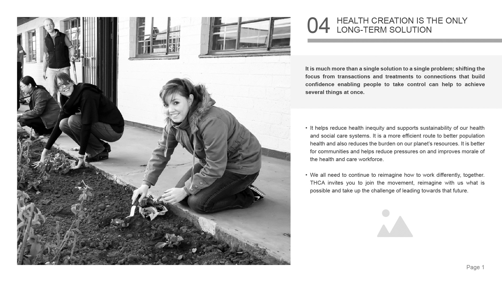

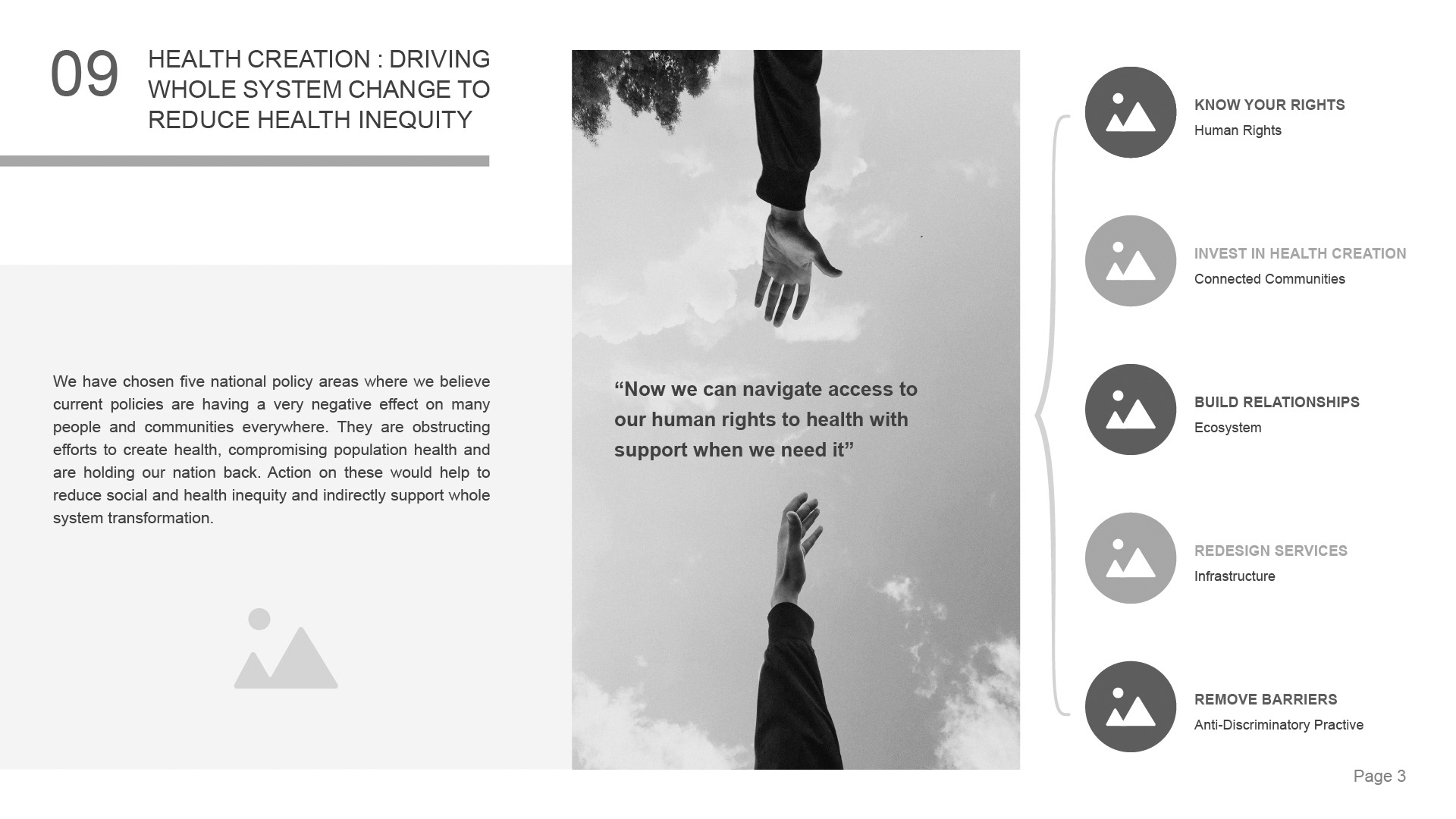
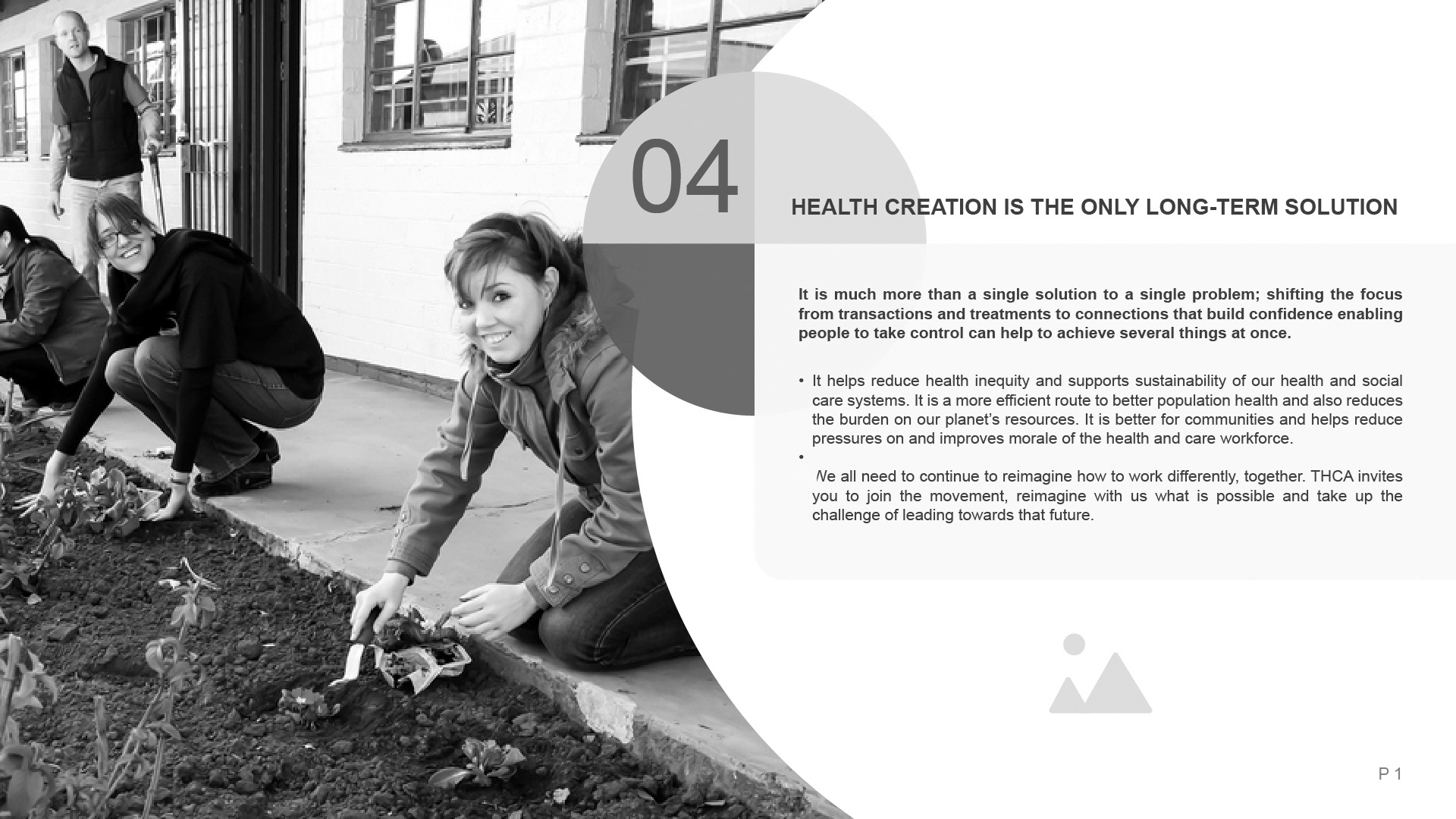

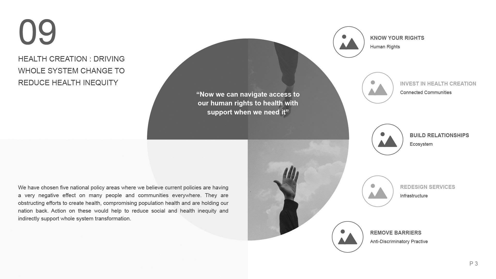
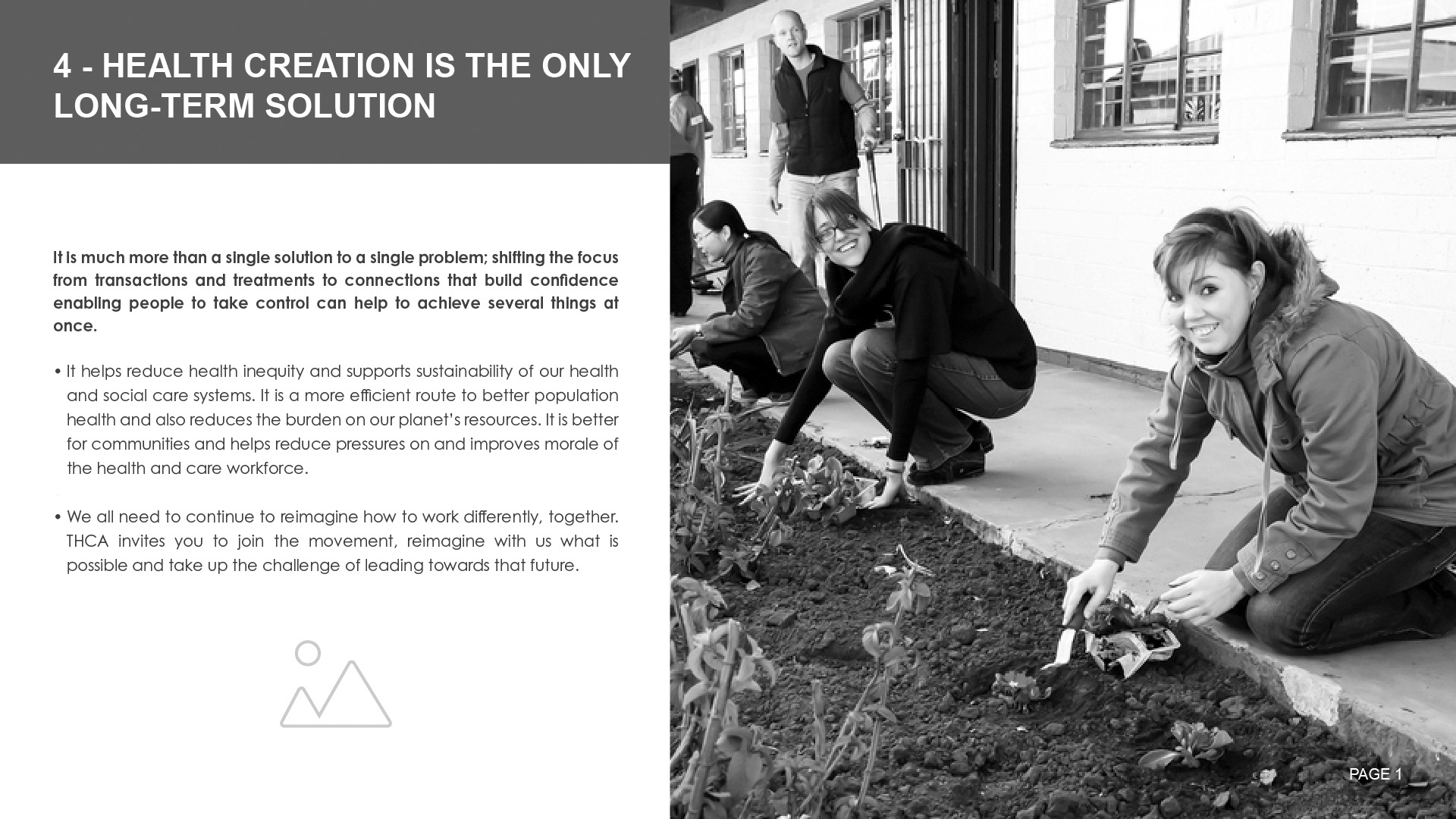
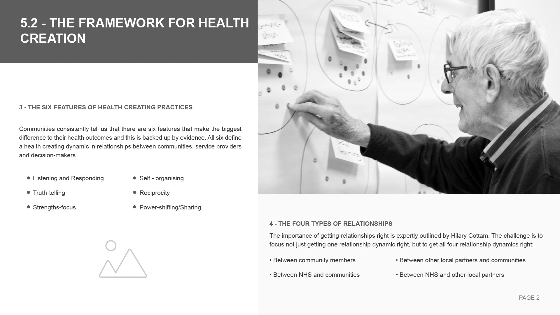
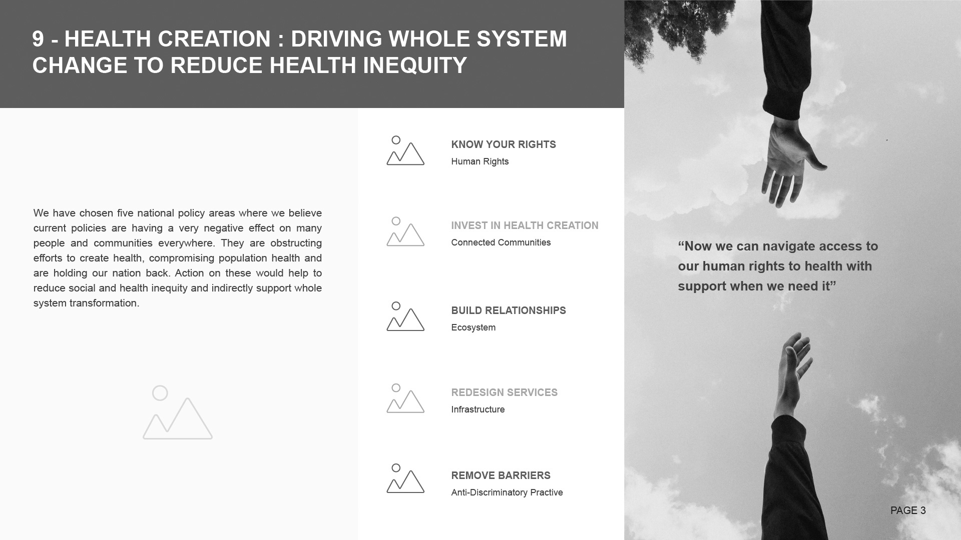
Neil and his team expressed a strong preference for version two, and requested further development of the concept. They also noted that certain areas contained too much white space, prompting me to refine the layout to achieve a better balance while ensuring clarity and visual impact.
4. Design & Visual Development
With a clear theme established for the document layout, I focussed on further developing the concept. I wanted to experiment with various fonts, colour schemes and other design elements, including the icons and the infographic Neil had sketched out for me. This exploration allowed me to create a more dynamic and engaging visual identity that aligned with the project's goals.
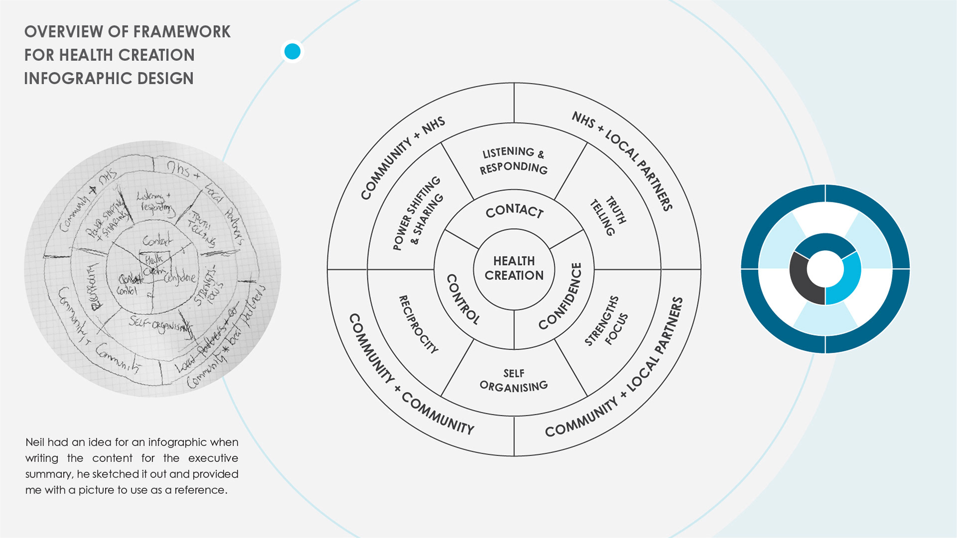
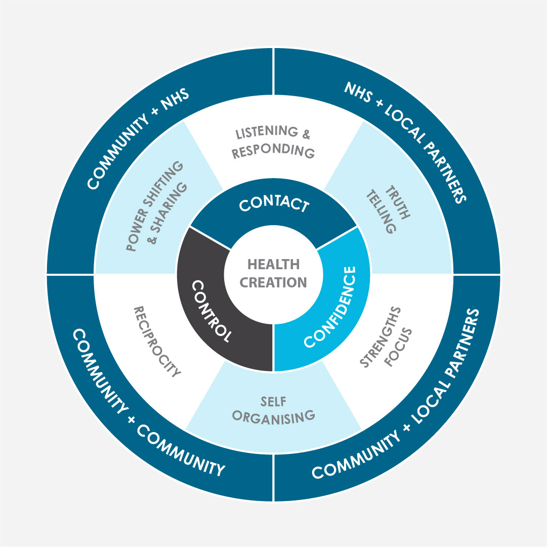
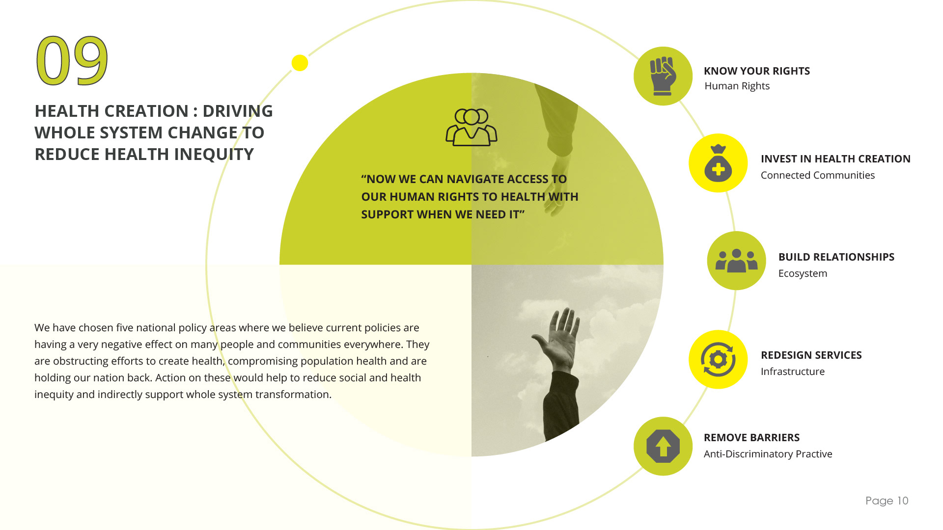
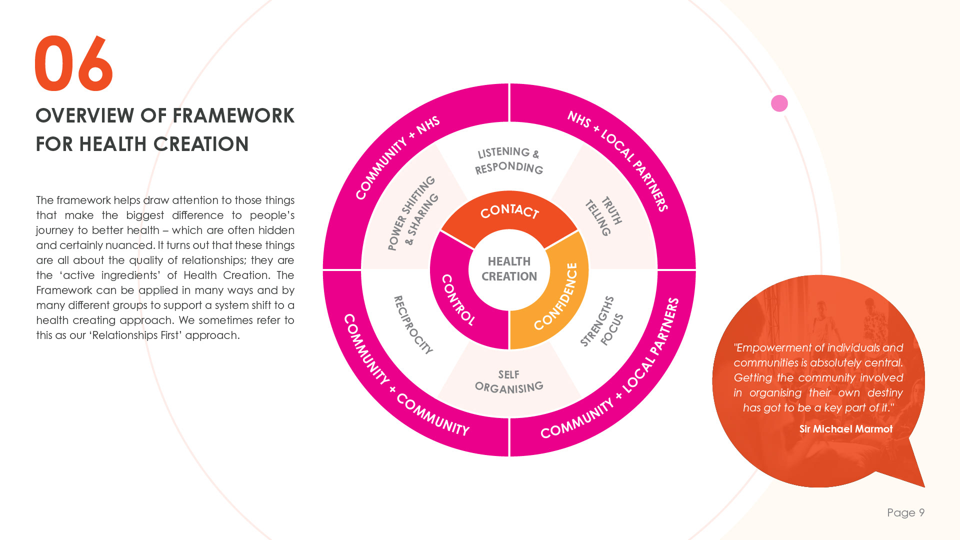
Neil already had a clear vision for the structure of the infographic. My task was to refine it and ensure that all the text was clear and easy to read. By focussing on the clarity and organisation, I aimed to enhance the infographic's overall effectiveness and visual appeal.
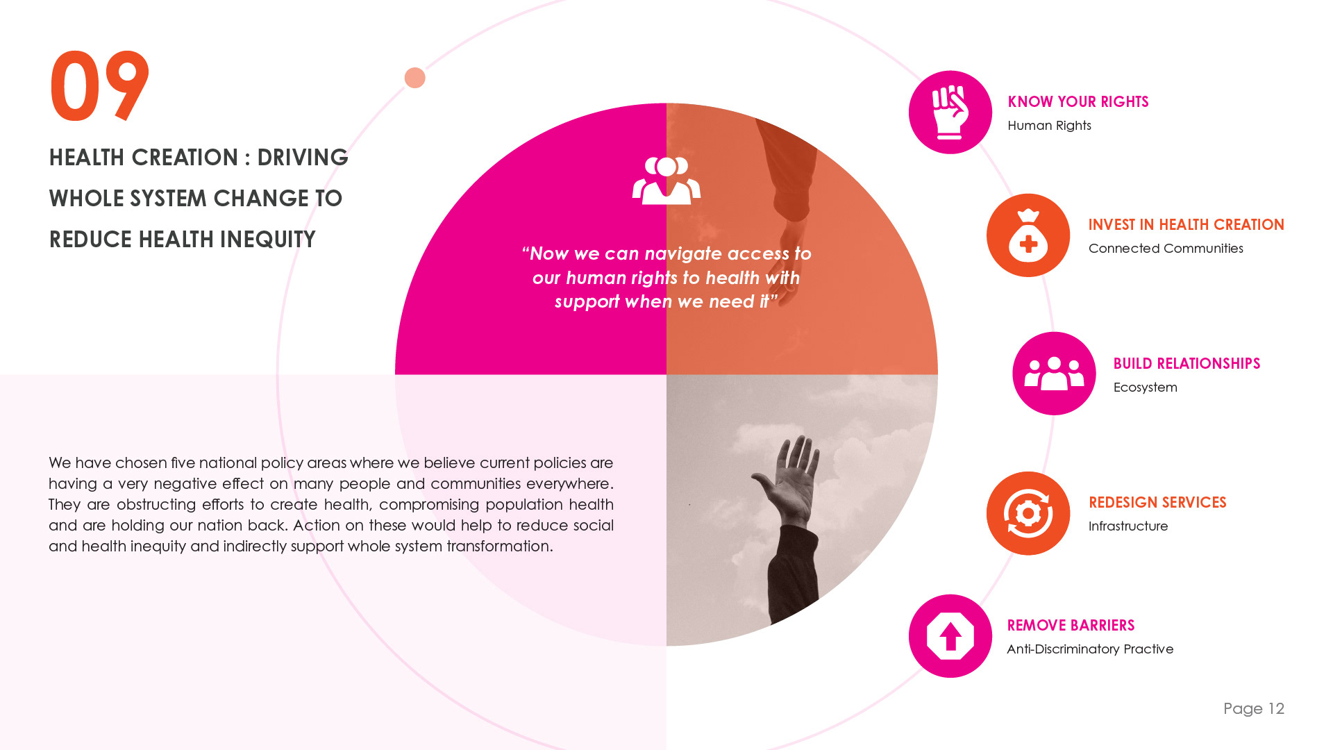
I worked diligently to ensure that each icon not only represented its respective concept but also contributed to a cohesive whole. I consistently experiment with various ideas, drawing from the best elements of each as I develop my designs.
I created three smaller and more refined colour palettes using the brand colours to ensure the slides remained visually clear and uncluttered.
While developing the next iterations of the presentation, I noticed that the brand's yellow and green were difficult to see against the white background. To address this, I conducted further checks on the colour contrast. My assessment confirmed that both colours were unsuitable in this context, as they failed to meet accessibility standards.
Although passing specific accessibility criteria wasn't a requirement for the presentation, I believe in designing materials that are accessible to as many people as possible.
Undeterred, I decided to make adjustments to the design to see if I could effectively incorporate these colours.
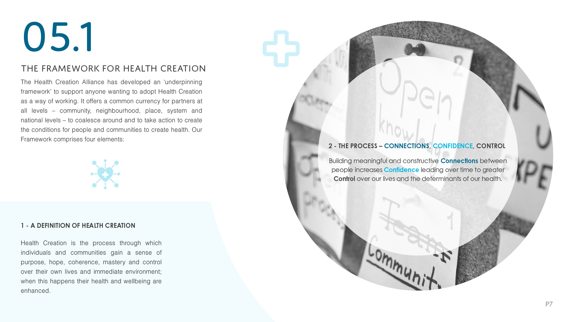

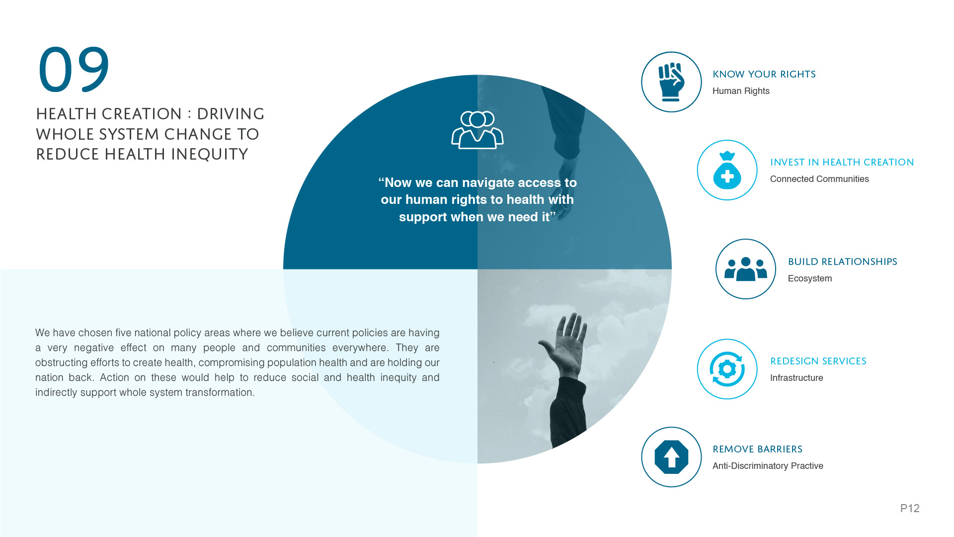
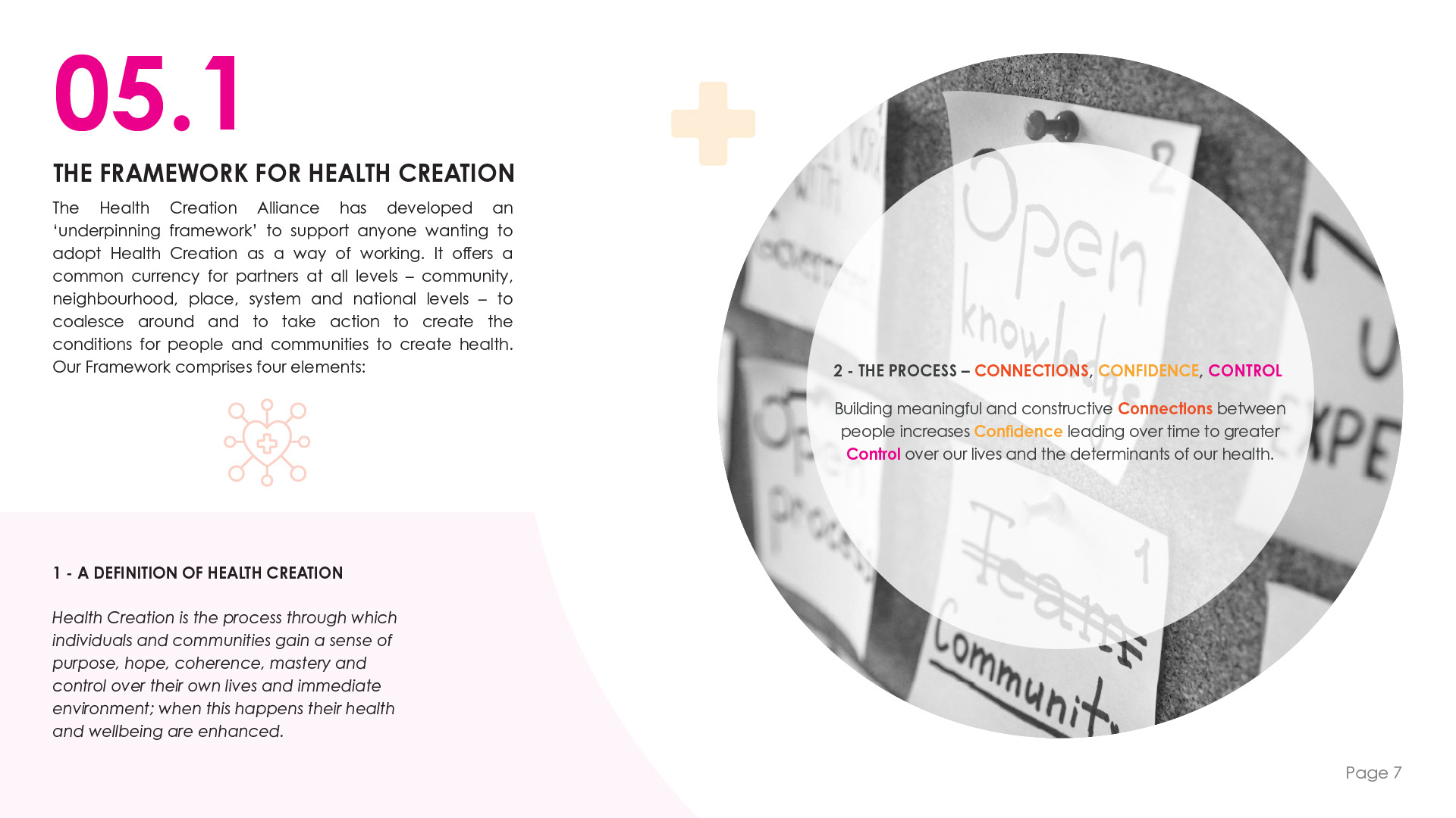
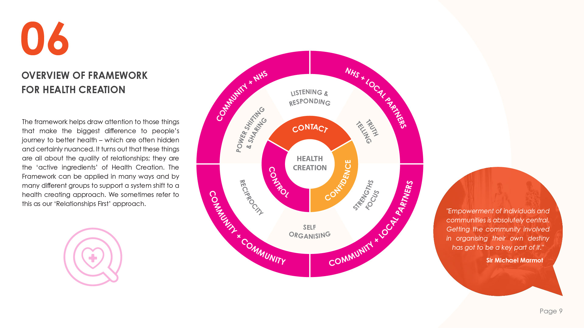
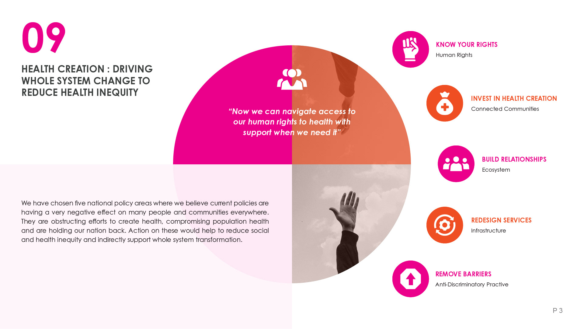
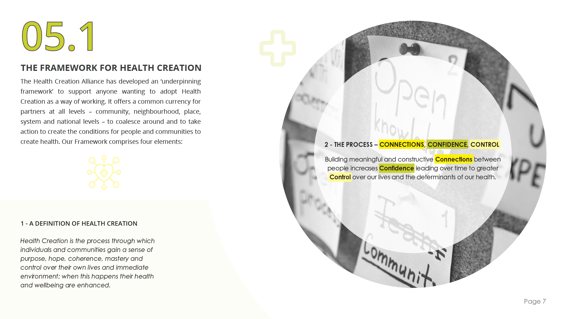
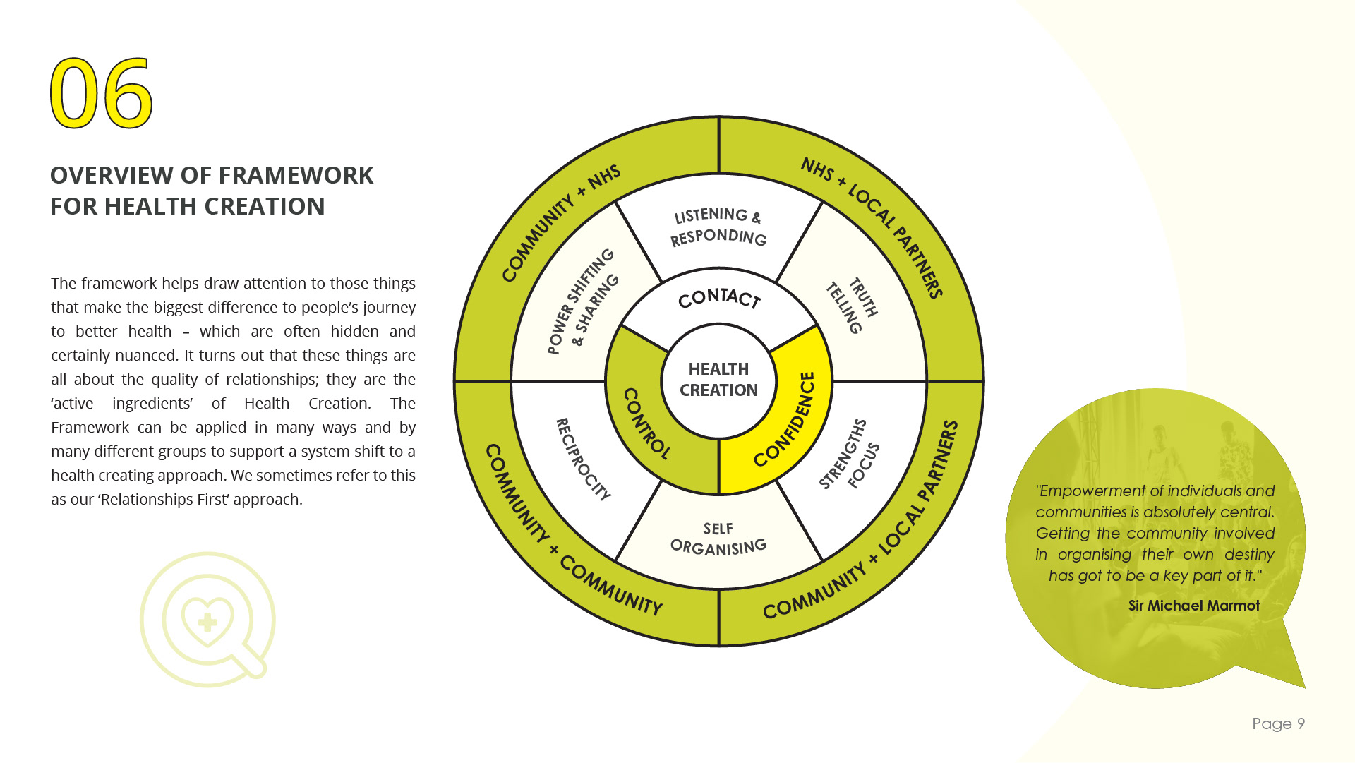
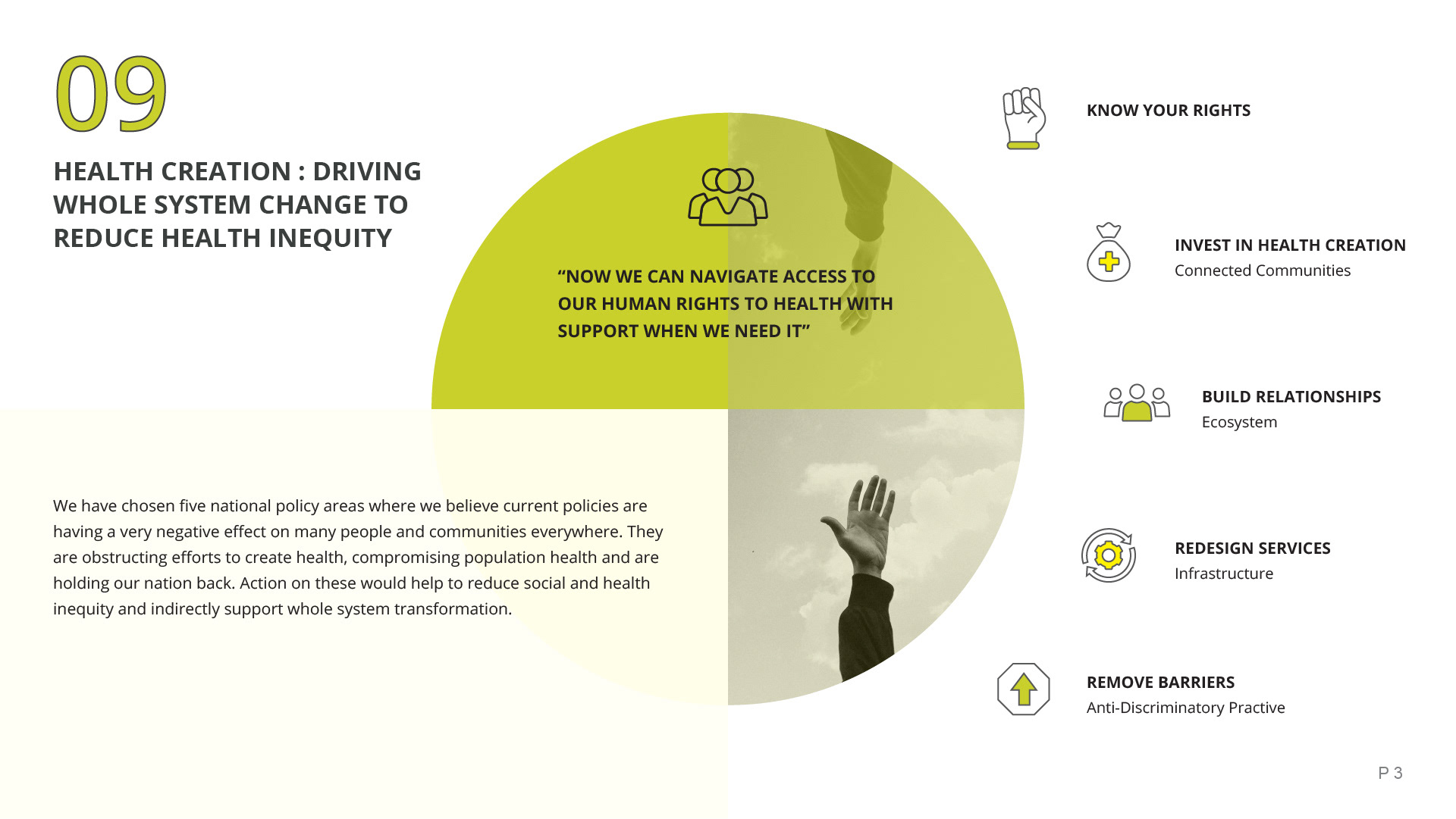
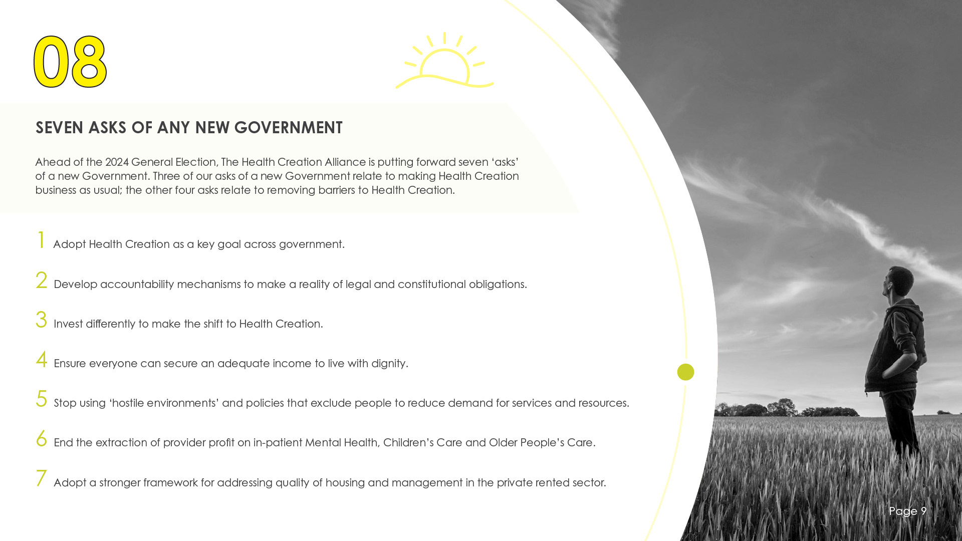
Focusing on providing different options for the fonts, the icons and the colours with these next examples and after making some minor adjustments to the yellow and green versions design, I presented the next three versions to Neil and his team.
They provided feedback indicating their strong appreciation for the layout and theme of the document to date, preferring the font & icons from version two. Both colour palettes from versions two and three were well-received, although Neil and his team were undecided between the two. Lastly, they noted that certain areas of the document felt empty.
Taking their feedback into account, I set out to create the final versions of the document.
Taking their feedback into account, I set out to create the final versions of the document.
5. Iterative Feedback & Revisions
For these final drafts, I wanted to ensure I addressed any large areas of negative space in a way that was consistent throughout the document.
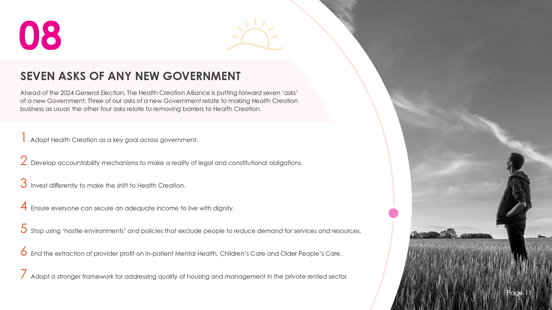
I added some simple circles that would 'orbit' the content on the pages. Although a subtle design element, these circles effectively broke up the negative space and helped to create a cohesive flow throughout the document.
I added some simple circles that would 'orbit' the content on the pages. Although a subtle design element, these circles effectively broke up the negative space and helped to create a cohesive flow throughout the document.
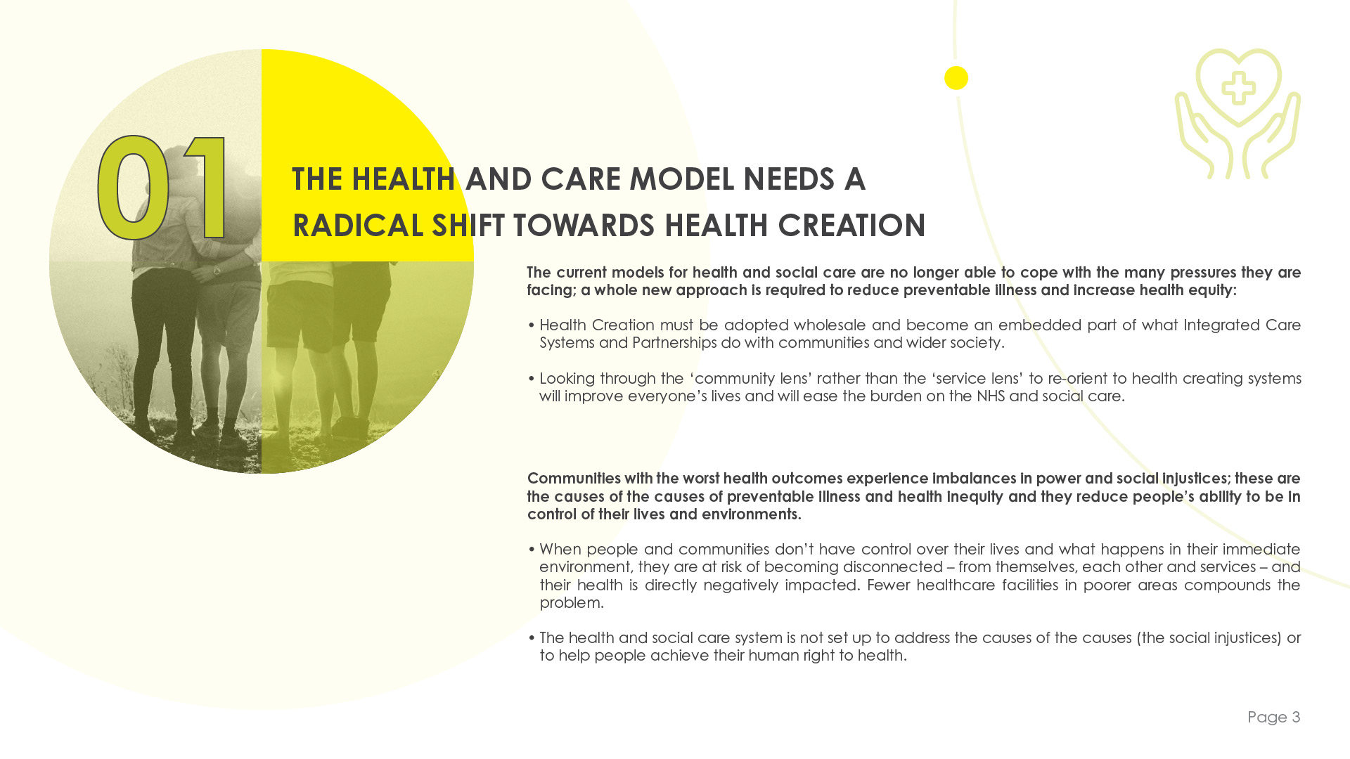
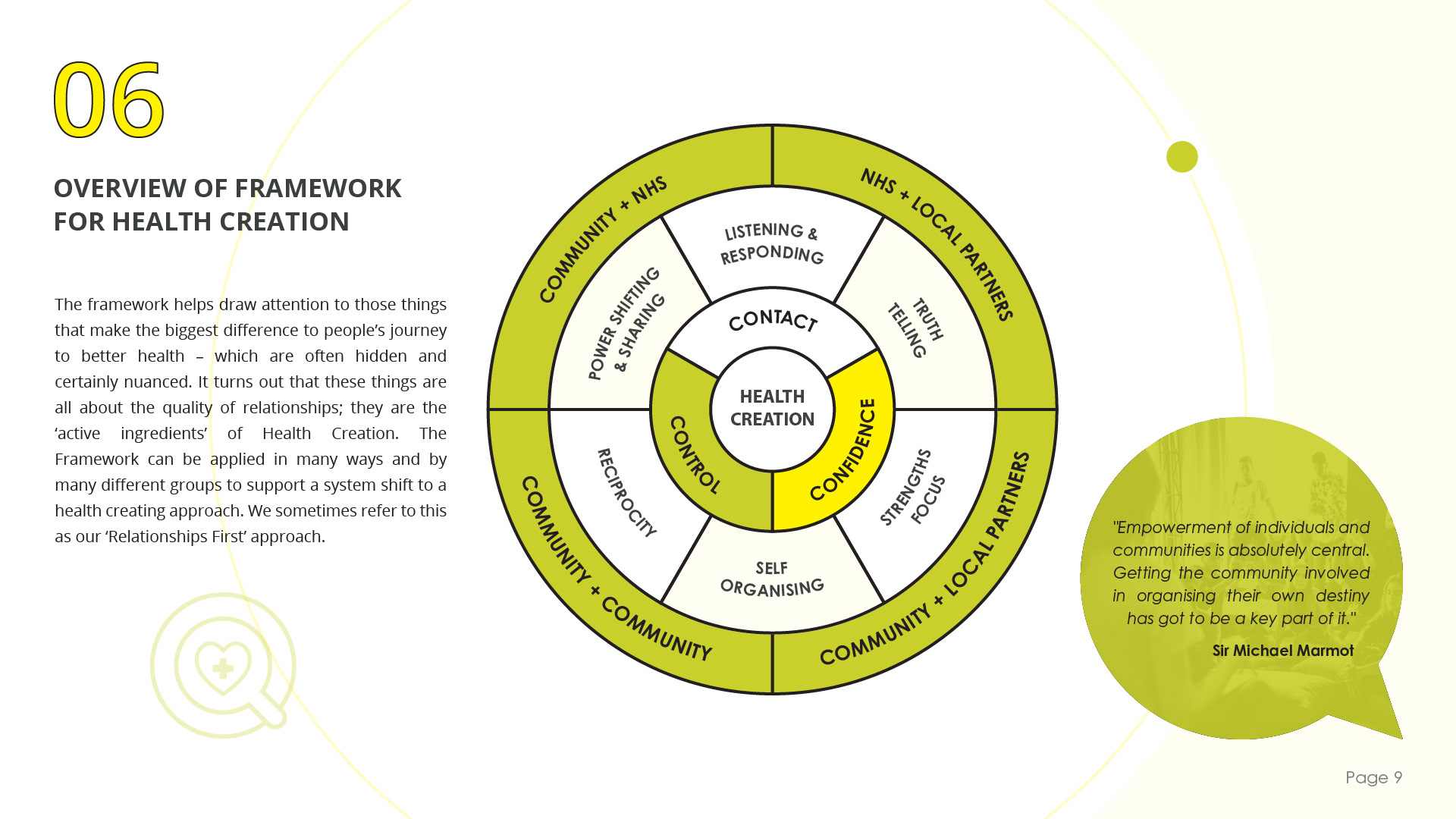
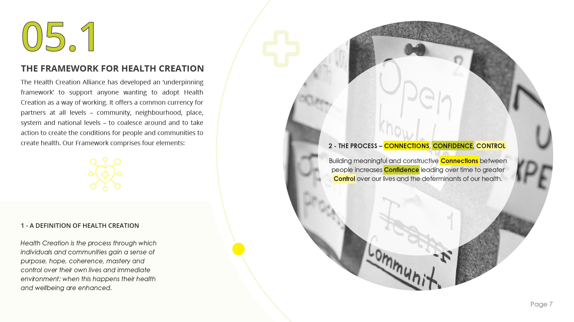


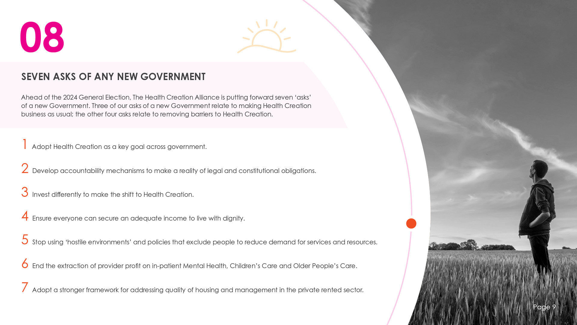

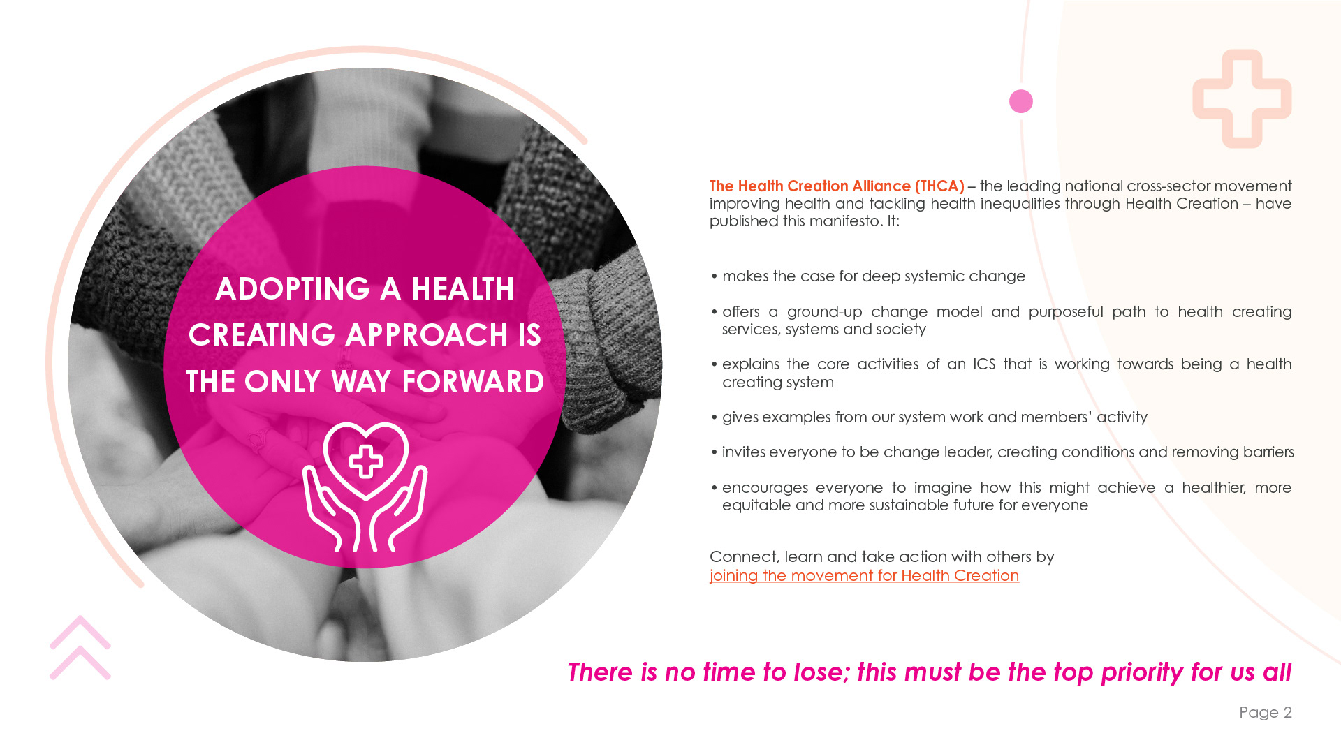
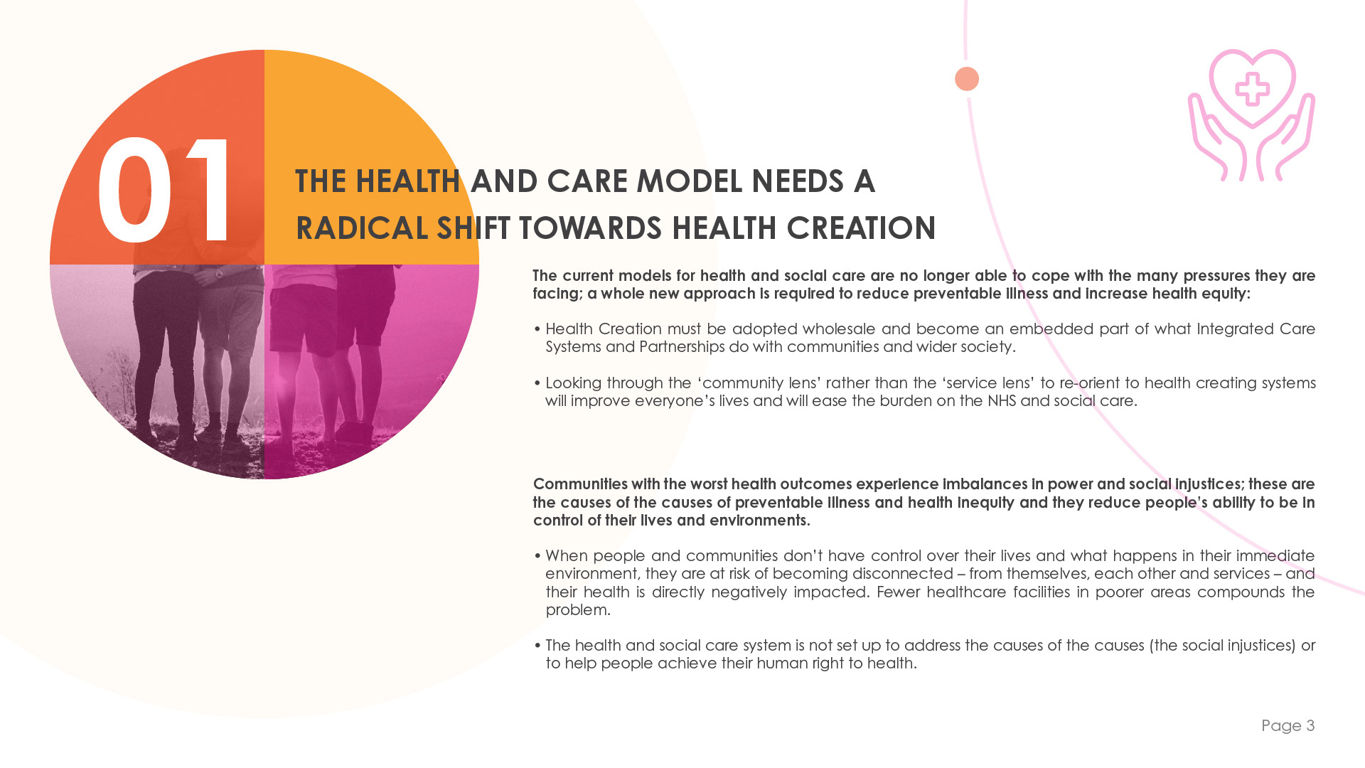
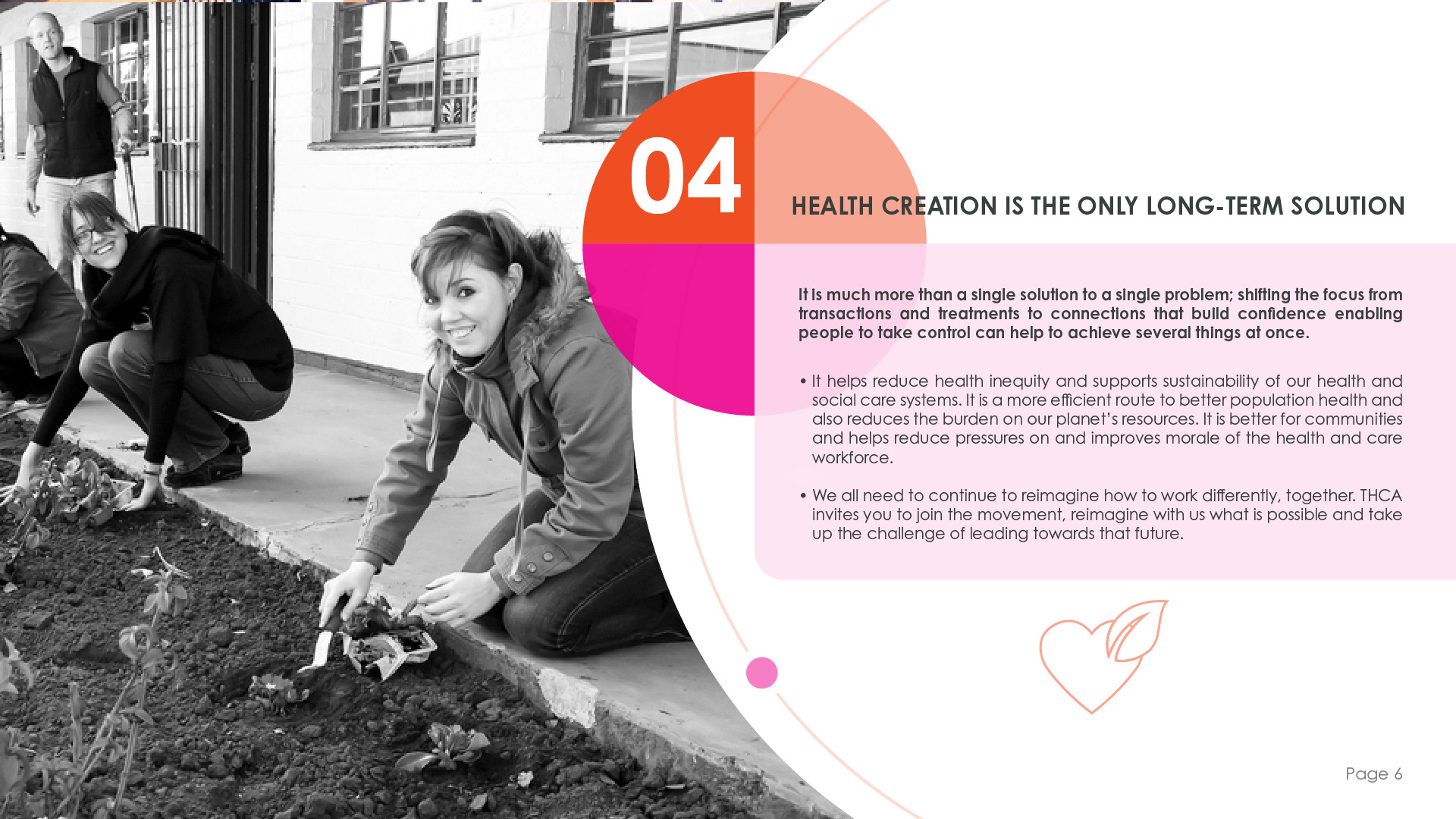
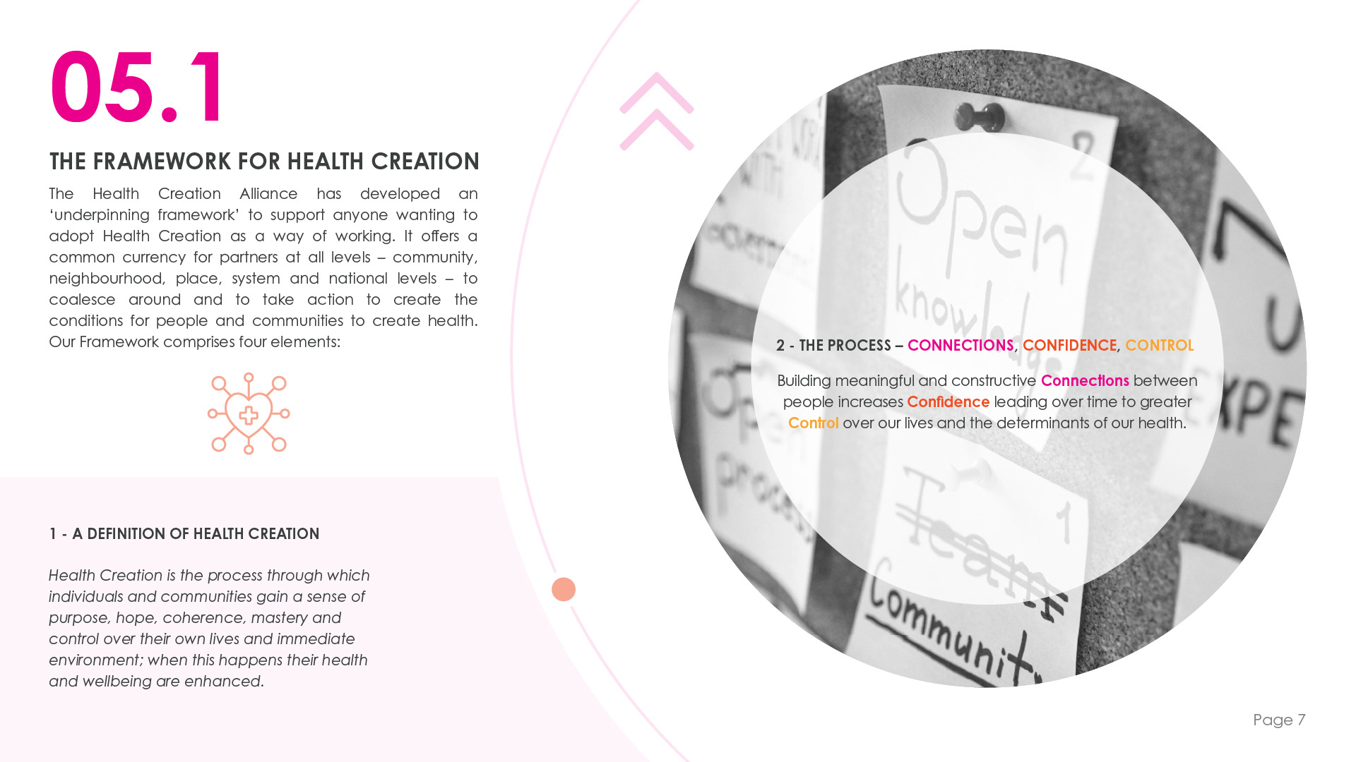
Neil and his team were highly satisfied with the final drafts and chose the pink and orange colour scheme, which they felt effectively conveyed the urgency of their message. Only a few minor text adjustments were needed for the final document; I had anticipated these changes and ensured they could be made easily, keeping flexibility in mind throughout the design process.
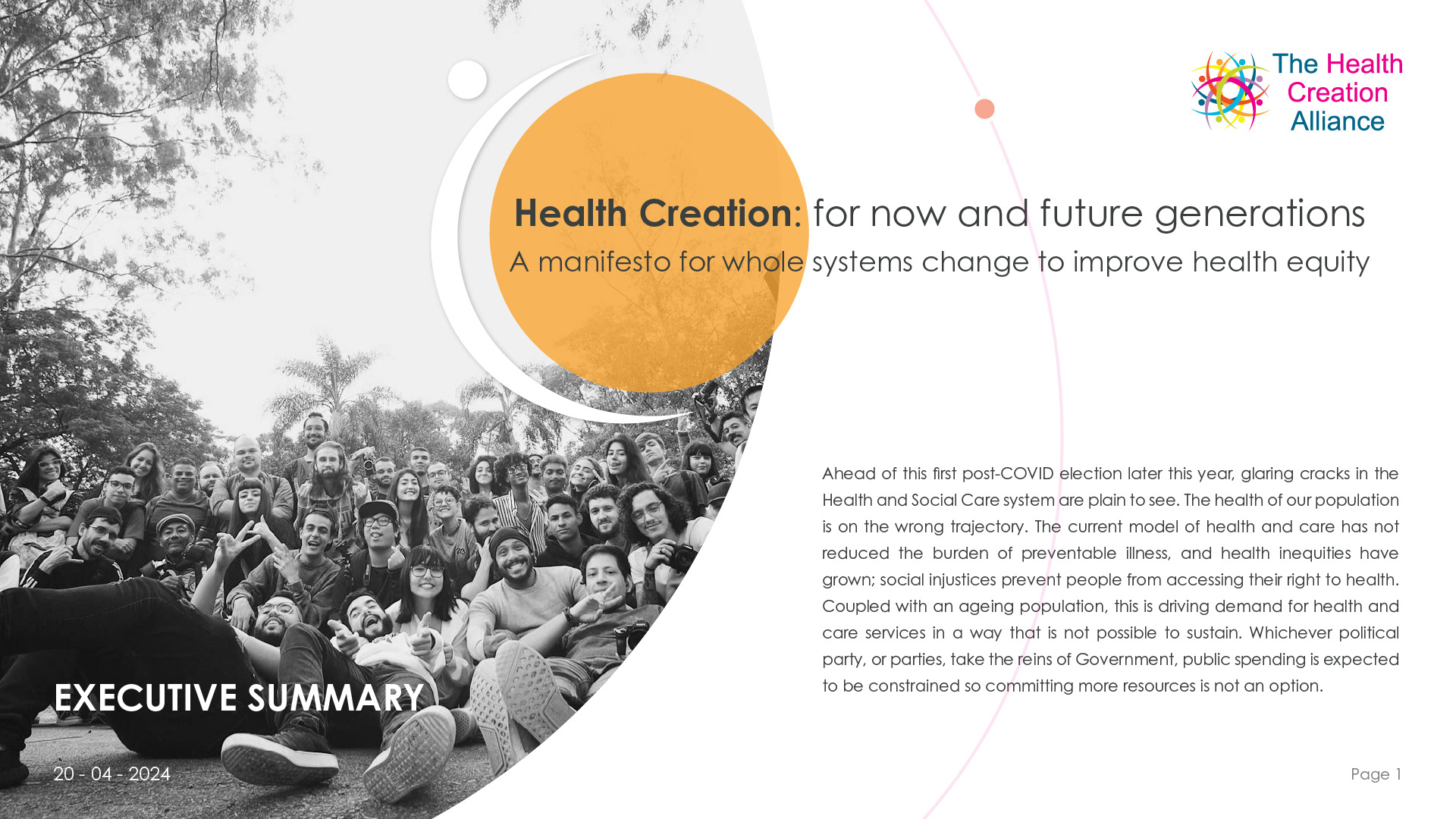




6. Final Reflections and Outcomes
The outcome of this project was highly successful. Neil and his team expressed their enthusiasm for the manifesto, and the launch resulted in a significant influx of new members joining the Health Creation Network. This positive response not only validated our design choices but also underscored the effectiveness of the overall concept in engaging the target audience.
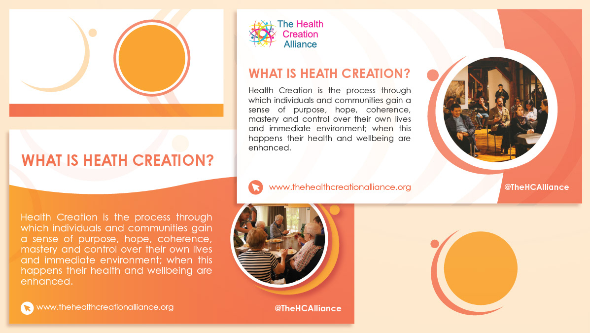
The success of the manifesto led to additional opportunities for collaboration, resulting in the creation of social media assets to further enhance the organisation’s outreach. This project not only reinforced the importance of thoughtful design in communicating key messages but also demonstrated the potential for impactful visual communication to drive community engagement and growth.
Through this experience, I gained valuable insights into the iterative design process and the significance of incorporating client feedback to refine and elevate the final product. I look forward to continuing this partnership and exploring new ways to visually support the Health Creation Alliance in their mission to improve health and wellbeing.
