Spotless Ladybirds, a new professional cleaning service specialising in schools and school transport, needed a brand identity that was both professional and engaging. Inspired by the company’s memorable name, I developed a brand concept that balanced appeal with a polished aesthetic. I chose clean, simple typography and added a little sparkle to the “O” in “Spotless” to tie the brand’s playful ladybird logo with the spotless theme.
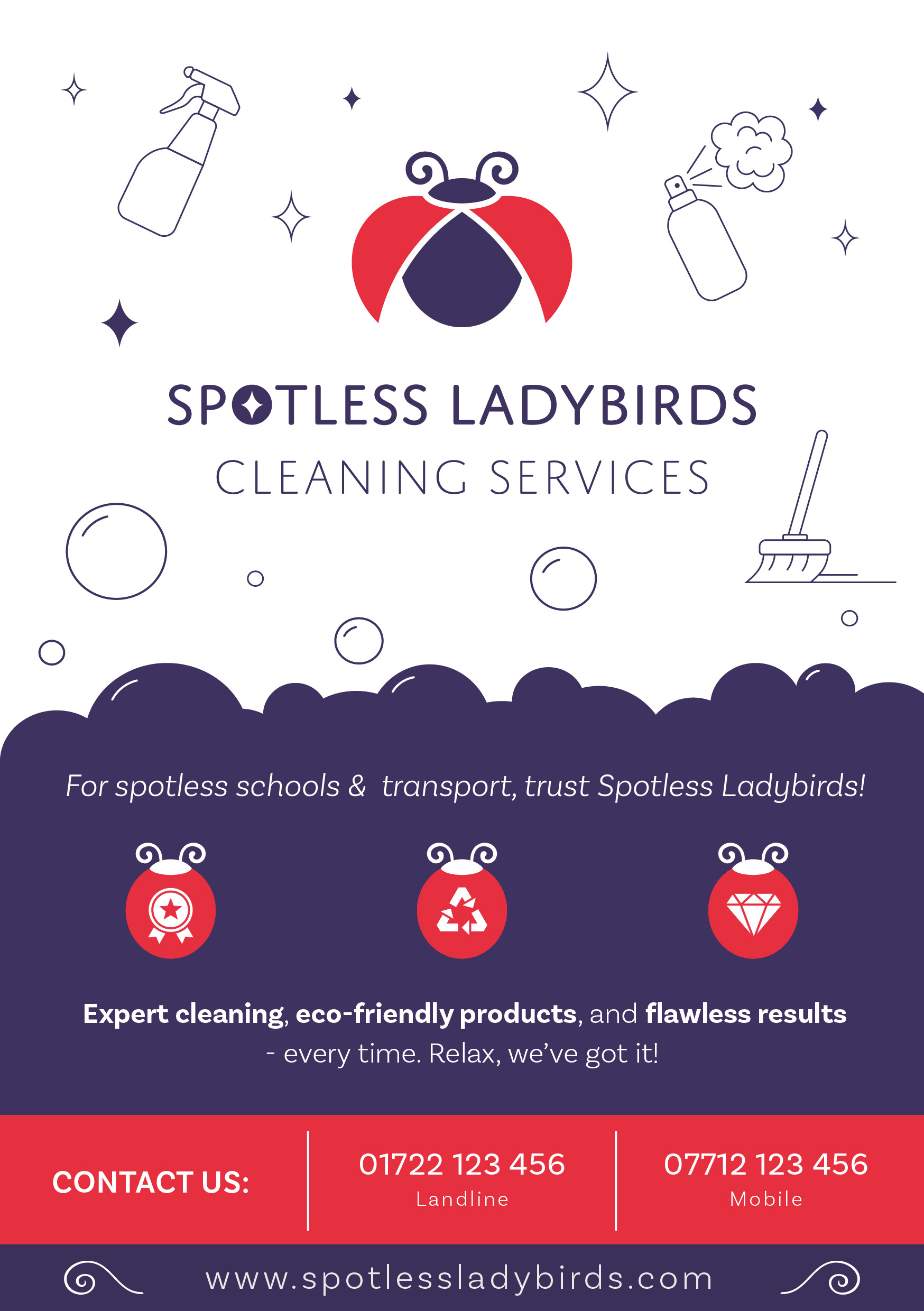
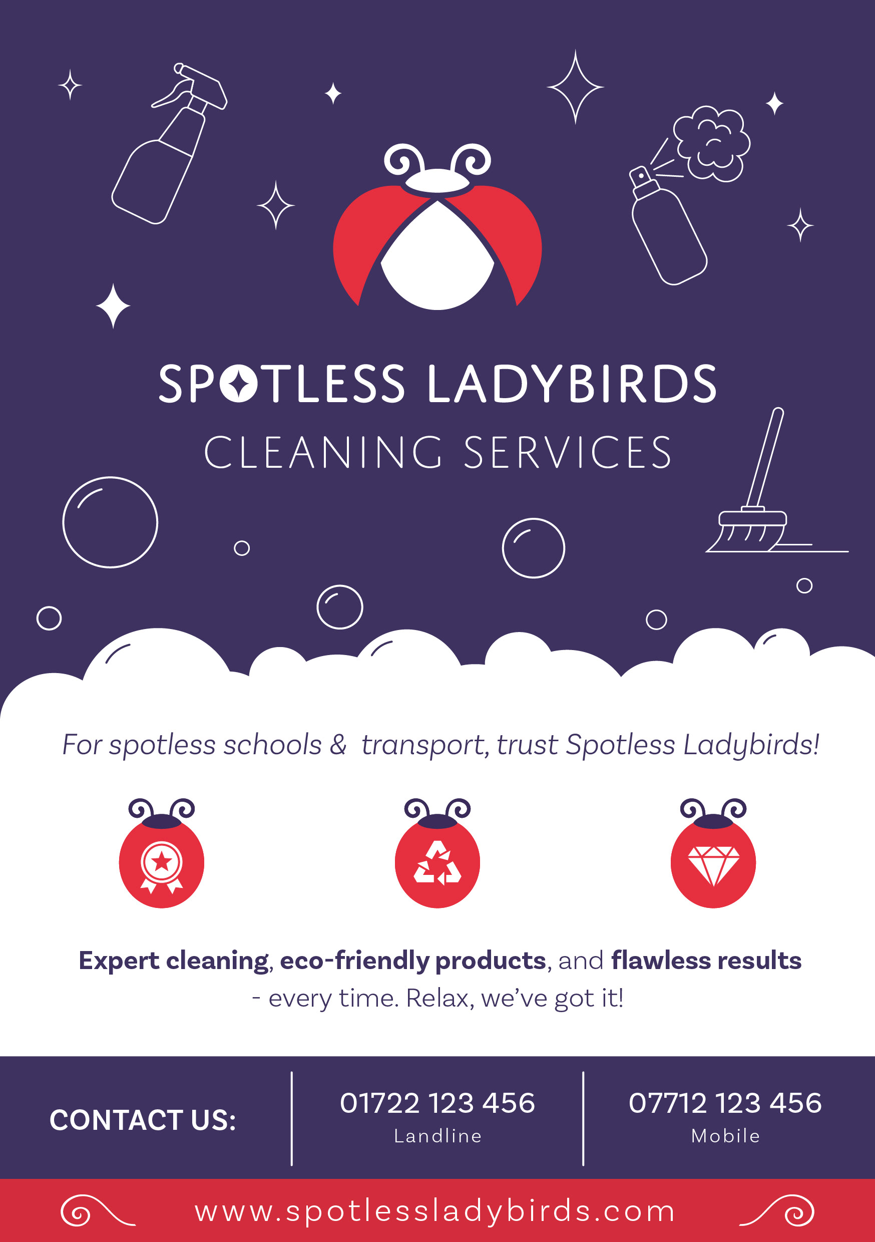
Delighted with the logo, Jamie commissioned a promotional flyer for print distribution to expand her advertising reach. The flyer needed to convey key service information while maintaining visual appeal. To achieve this, I incorporated ladybird icons, the sparkle from the logo, and some soapy bubbles to organise the content into clear, accessible sections, ensuring the design was both informative and engaging.

Jaime asked for support with sourcing the uniform supplier, ensuring the right materials were procured for ease of clean, comfort, and stain protection.
I managed to get the colour values from the uniform company and subsequently was able to make subtle alterations to the red to ensure it would complement the uniform.
