Simon, the owner of What Cobblers, a long-established, family-run shoe repair shop, sought a brand refresh that honoured its heritage while embracing a modern touch. The brief required a new shopfront sign and a versatile logomark for both print and digital applications. The design needed to be instantly recognisable, reflecting the traditional aesthetic of a classic cobbler’s shop with a refined, contemporary edge.




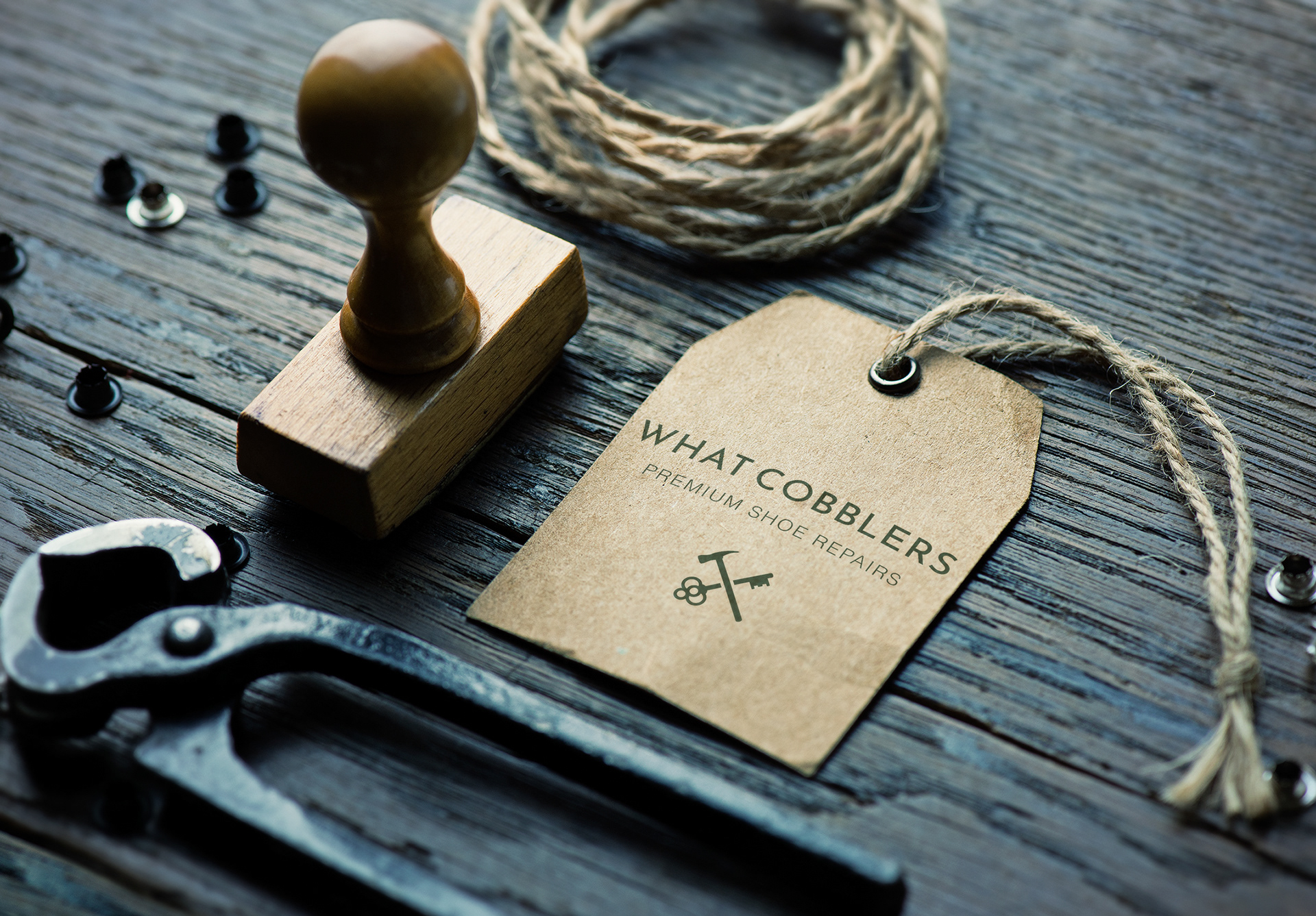
To achieve this, I selected a traditional deep green to communicate the premium, time-honoured craftsmanship of shoe repair, aligning with Simon’s request for a vintage feel. This was complemented by a clean, modern typeface, striking a balance between heritage and relevance. The logomark features the iconic symbols of a crossed key and hammer, representing both the shop’s core services and its location outside the Cross Keys shopping centre.
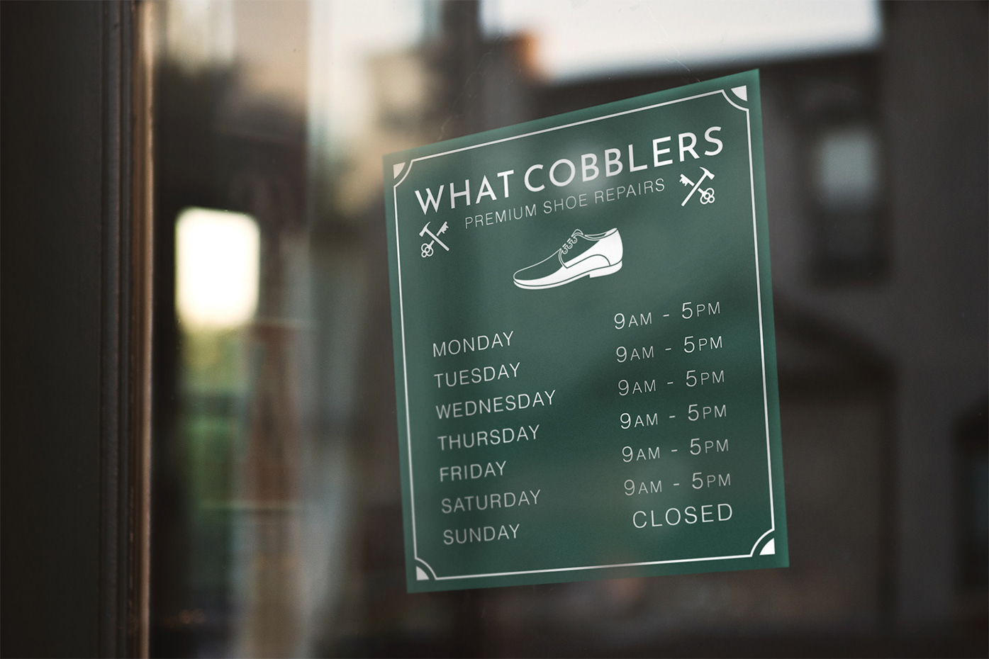
Simon requested a bespoke “open” sign to align with the shop’s aesthetic. I designed a custom sign with a classic layout and a subtle modern edge, incorporating established brand elements and a stylised shoe graphic as a focal point.
